
First Chapter
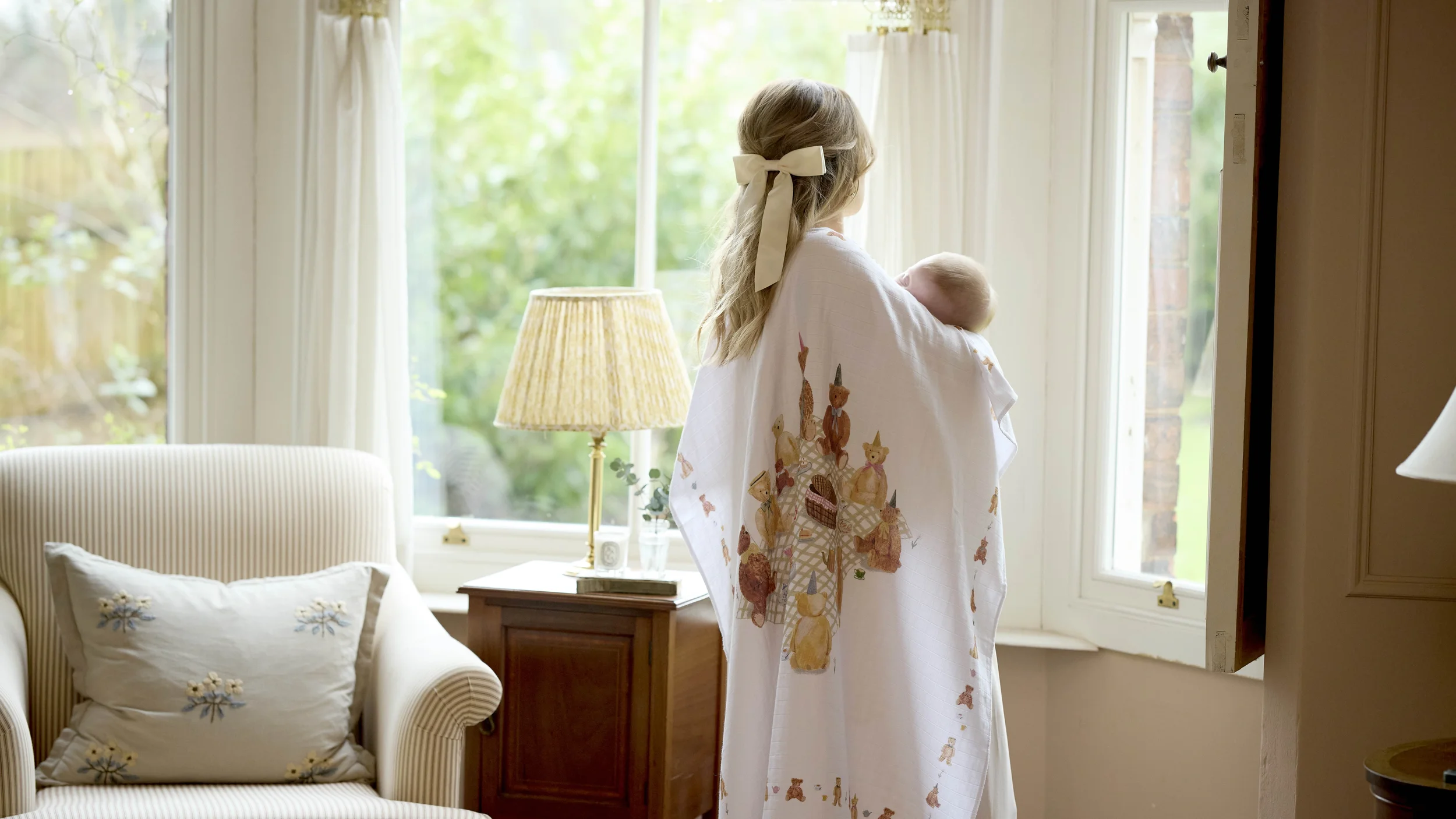
First Chapter is a luxurious British-born baby gifting brand rooted in nostalgia, fairy tales, and the magic of early childhood. Founded by Amy, who recognised that truly beautiful gifting for new parents was something the market was simply missing, the brand needed an identity that could hold all of that feeling and translate it into something parents would instantly fall in love with.
The starting point was strategy. Understanding not just what First Chapter sold, but what it meant. This is a brand built around aspiration and emotion, the desire to give something truly beautiful, something that would be kept, remembered, and passed on. With gifting at its core, the identity needed to feel like the gift itself: considered, special, and worth treasuring.
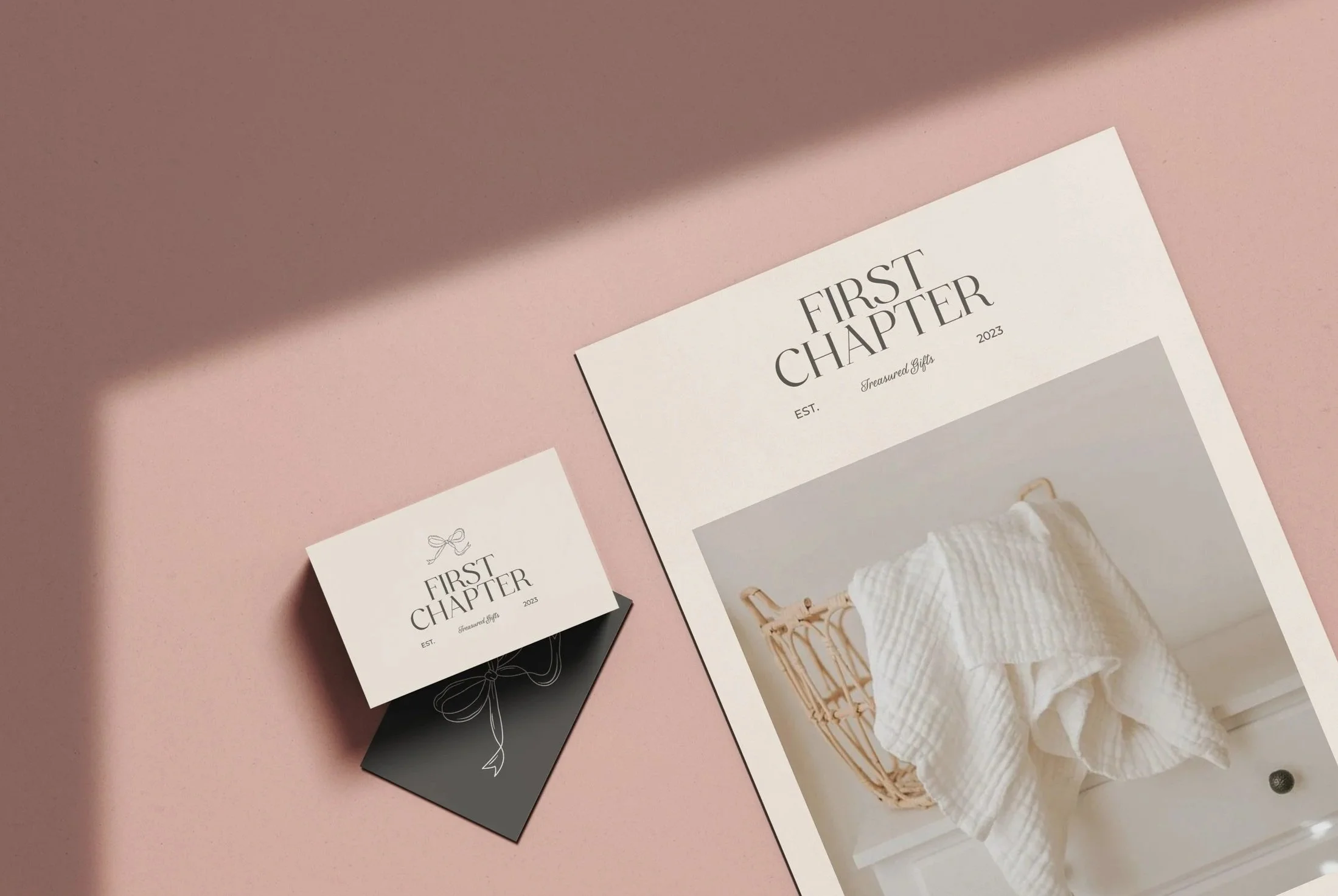
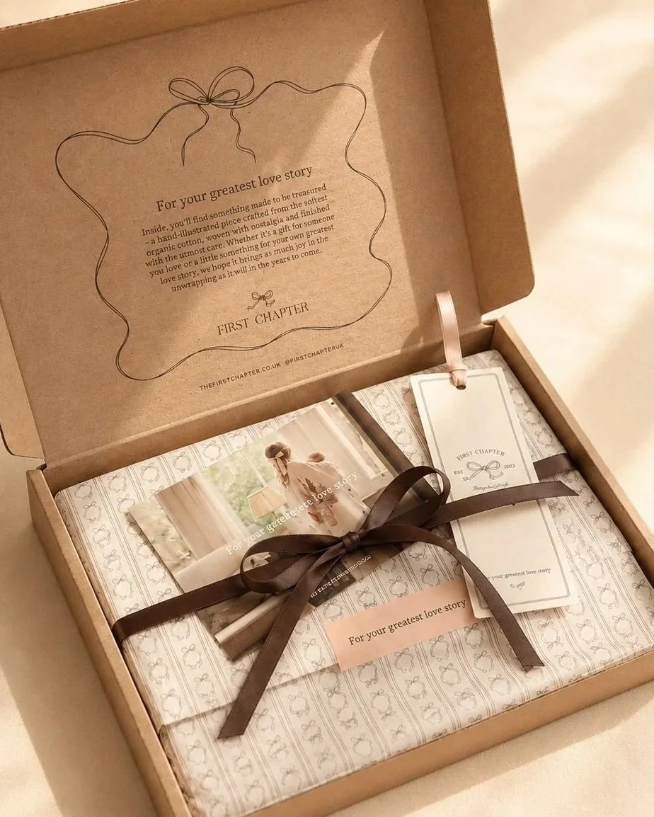
From that foundation, a visual world took shape. Soft and romantic, rooted in British heritage yet completely contemporary. A brand that could sit comfortably in the nursery and on the doorstep, on a gift tag and on a social feed, always feeling cohesive and always feeling like First Chapter.
The logo and its ribbon icon became the quiet signature of that world, a detail that speaks to gifting and quality in equal measure. Rather than a single mark, a suite of variations was developed, each with a specific role to play as the brand grows. The primary logo leads across marketing and brand material, while a curved variation was created for apparel and packaging, sitting beautifully on product and adding that gifting moment at the point of unwrapping. A linear lockup gives flexibility for wider format applications, and a monogram draws on traditional British heritage, designed to be used on personalised cotton items and customer communications, working especially well as a wax seal. Together they create a cohesive visual language that can flex across every touchpoint without ever losing the thread of what First Chapter is.
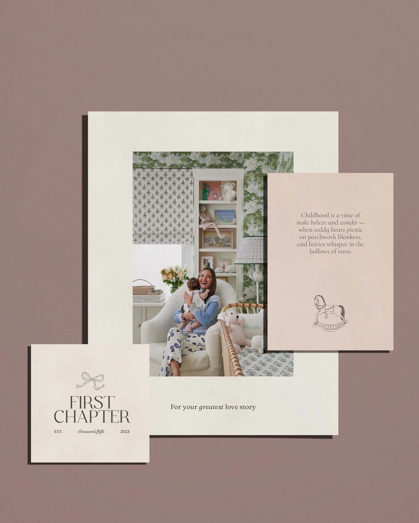
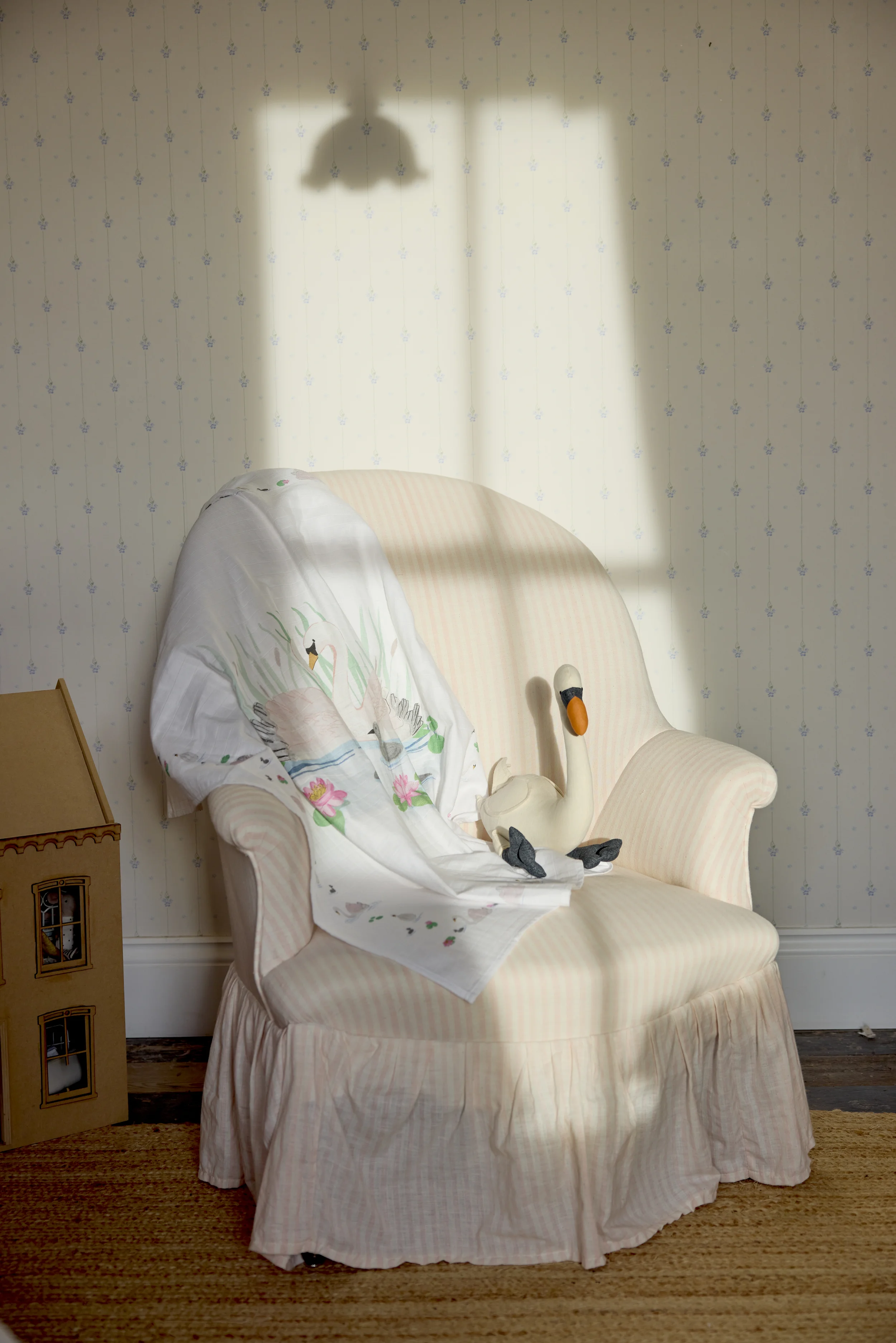
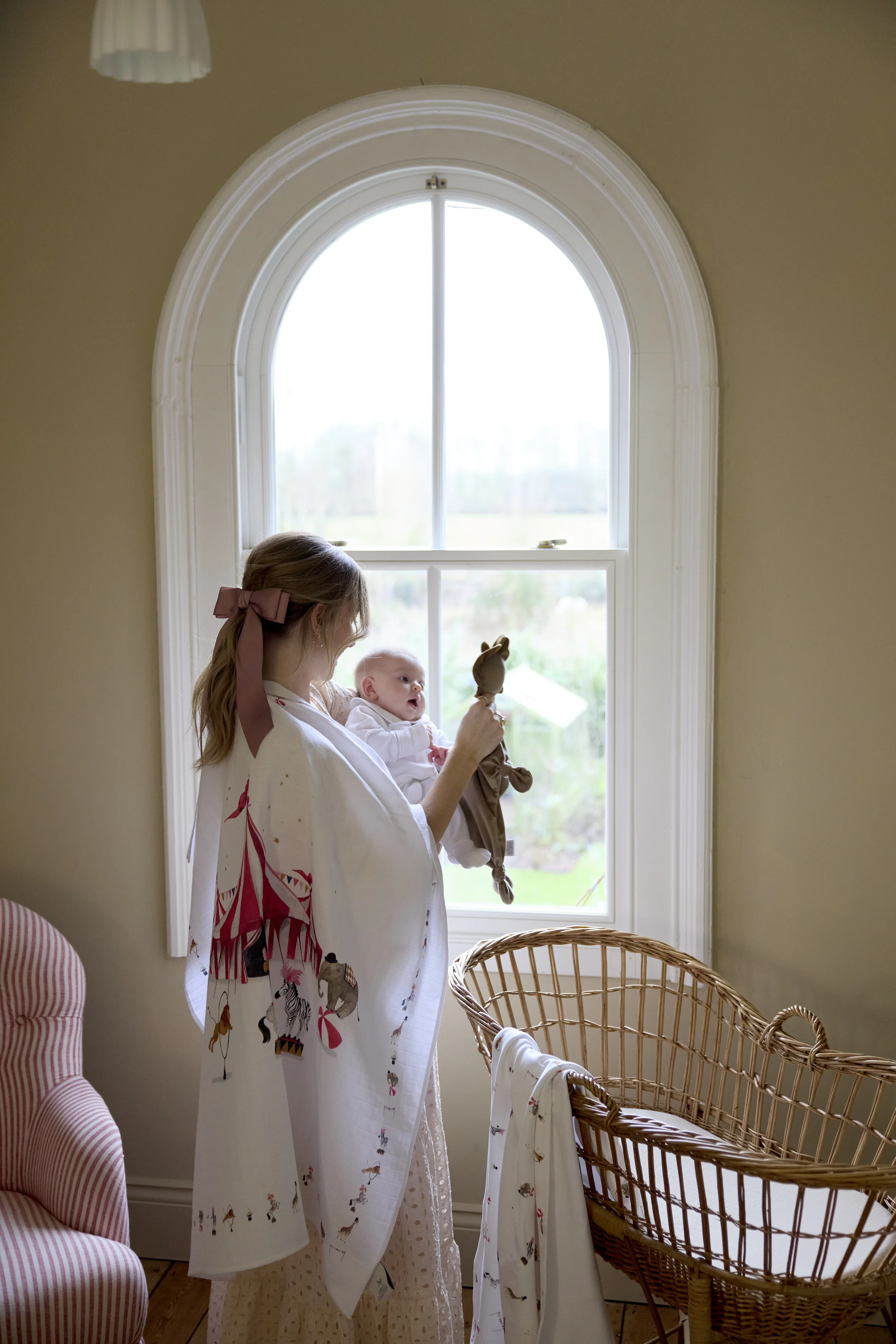
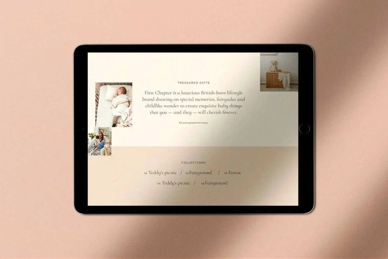
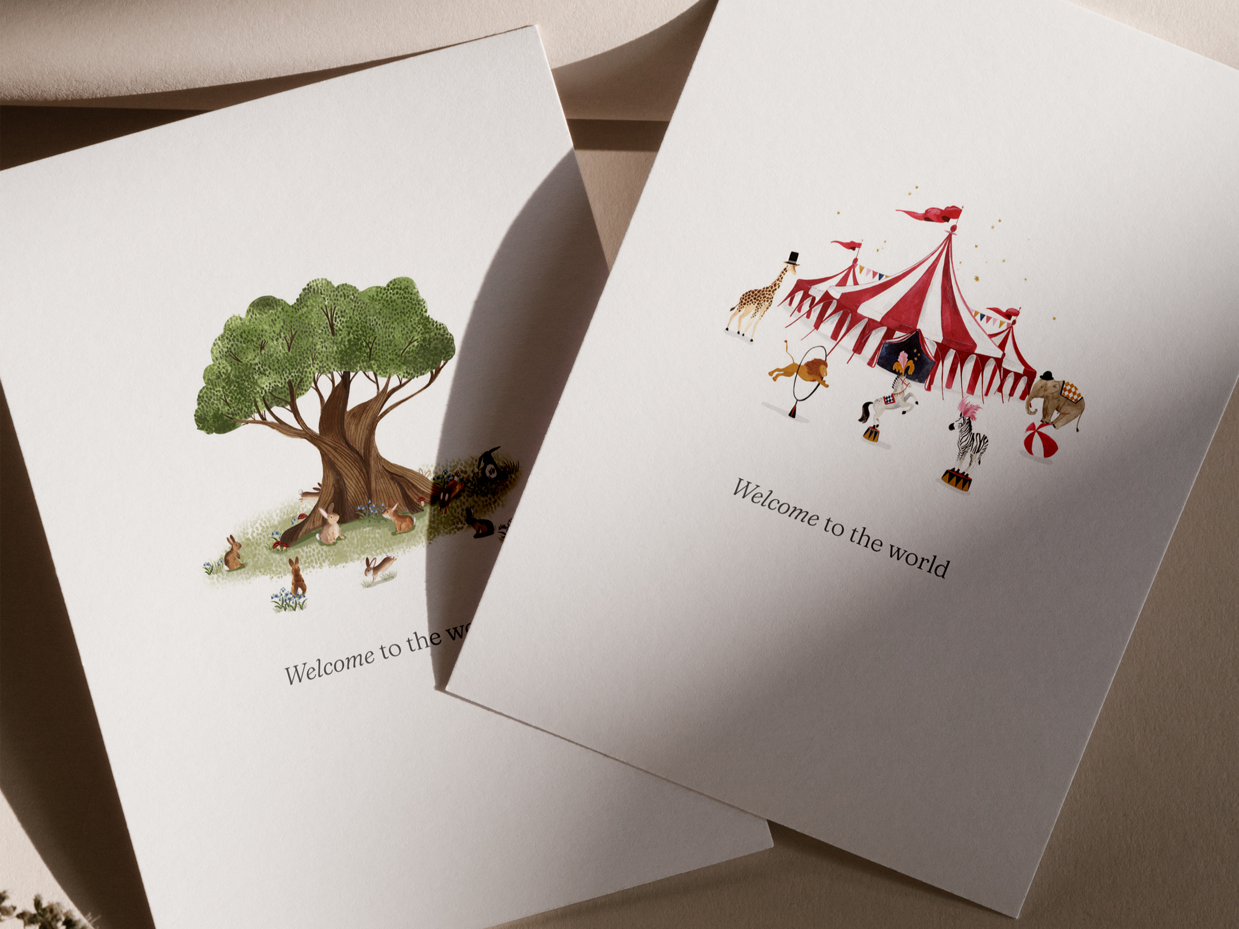
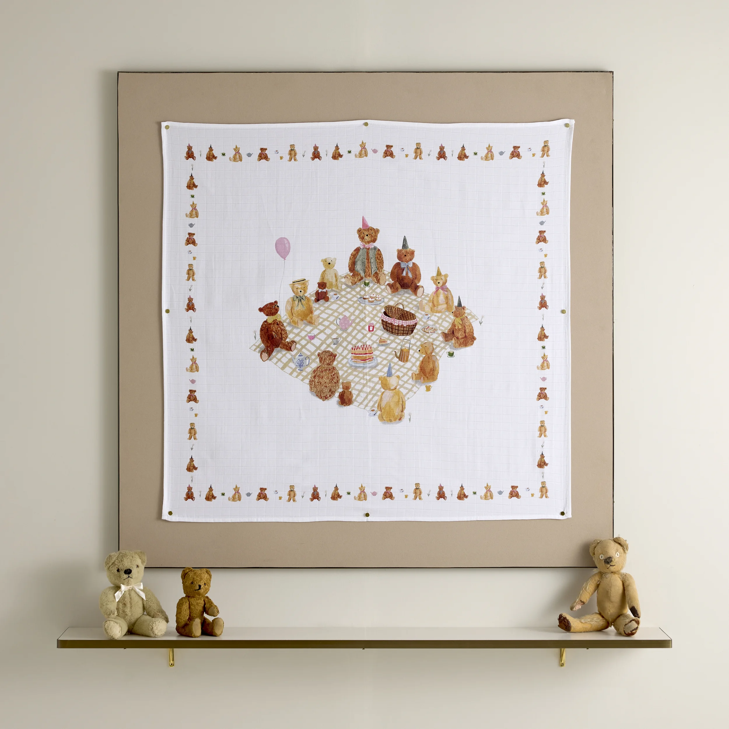
Four collections sit at the brand’s core, each one rooted in the stories we carry from childhood: tales that pass between generations, timeless and completely unique to this brand. A secondary world of hand-crafted illustrations extended that storytelling further, bringing the brand’s pillars of gifting, heritage, quality, and memory to life in a way that felt premium and personal. The colour palette drew from the softest natural tones, warm and human, always calm. The voice was given the same care: luxurious yet whimsical, inviting new parents into a world they genuinely want to be part of.
The result is an identity that does what the best brands do. It makes people feel something before they even see the product.
Amy Harrad